Japanese Calligraphy, Japanese Culture & Traditions
What Make Good Calligraphy Good? – Judging the Beauty of Shodō, Japanese Calligraphy
Japanese calligraphy – shodō in the native tongue – is an ancient art form combining literary and visual expression. Here at the OrientalSouls blog we’ve learned about its tools, its materials, its history, and even its meditative properties, but today I want to investigate how exactly it is that experts and teachers judge a piece of calligraphy. How do we know when an artist has created something worth looking at? What should we look for when trying to distinguish the beautiful from the mess? And what are the different categories experts group Japanese calligraphy into?
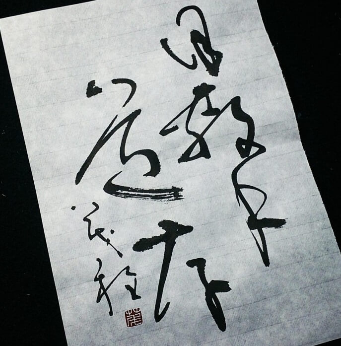
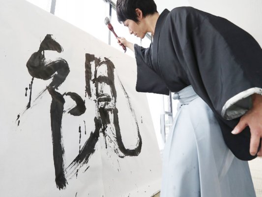
With such swift, flowing lines, sometimes even the most famous and revered pieces can appear rather rushed – maybe even sloppy! But with the right knowledge, even an amateur is able to pick out from a stack those demonstrating the aesthetic beauty Japan’s best artists spend their lives developing.
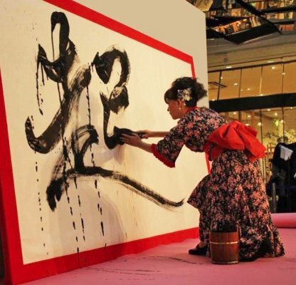
(Image: 49plus.jp)
Whether you are taking classes, practising at home, or have yet to ever lift a brush, today’s article is here to help you make sense of the subjective, personal process of assessing the beauty in calligraphy. While it sounds like there aren’t any rules – that the artist and critic are just making it up as they go alone – in fact there are several set of aesthetics that help us find the beauty amongst the chaos. Let’s get to the bottom of the seemingly intangible beauty of Japanese calligraphy.
Three ‘Flavours’ of Calligraphy: Different Aims and Different Results
So taking a calligraphy brush, dipping it in calligraphy ink, and writing calligraphy on calligraphy paper = beautiful calligraphy, right? Not quite. There are in fact different types – or styles – of calligraphy in Japan. Each comes with its own tradition, method, certification, and … wait for it … aesthetic. That’s right, depending on the style you are writing in, the criteria used to judge your work are different. A beautiful work of one style might be judged to be far too rigid or precise for another style.
(Image: syodou.net)
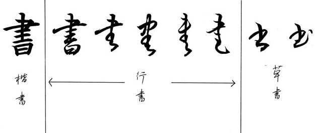
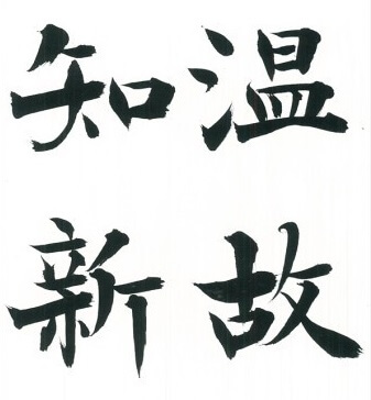
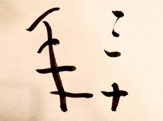
Let’s start with an example. Kaisho style is the clean and clear reproduction of Japanese characters as they would be written with a regular ballpoint pen in block letters. The angles are balanced and the proportions are textbook. This is the newest form of this ancient tradition, and it suits the eye used to newspaper or electronic font. It can be seen on the chart above on the far left. Easier to make out the intricacies of the character, isn’t it? That’s why it’s a great starting point. All other forms of calligraphy reflect a similar balance, to a degree – in fact, kaisho style is a clear derivative of these older styles. What this means is that it is possible to see where the artist might slip up. If the topmost horizontal line is longer than the middle line, for example, this is a clear mistake. Balance as well as stroke order are everything. Rigidity can be apparent, as accuracy is judge based on sharpness of angles and lines.
(Image: kinoshitamariko.com)
Another important aspect of kaisho is that the brush is lifted after every stroke, making it very clear to both the artist and viewer where one stroke begins and another ends. Compare with the older, more fluid forms and you can see how deliberate and almost mechanical this style is. That’s not to say there isn’t anything beautiful about it, though … When judging kaisho, experts are said to focus on the curves – places where a careful and measured curve is applied or, equally important, where a curve isn’t applied. In true Japanese aesthetic and fashion, it is as much about what is as what isn’t.
As a small aside, I would personally recommend the balanced kaisho style for those of us who a) study Japanese, and b) want to improve their penmanship for use in daily life (ie. with a BIC pen!).
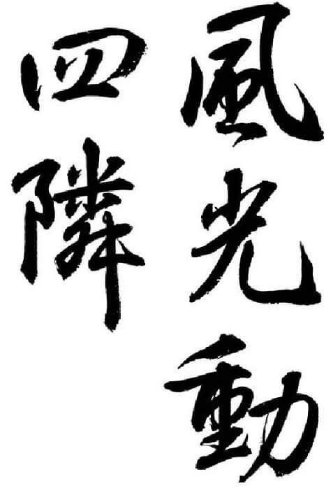
Next we have gyōsho, the middle ground between the ancient scrawling of the oldest Buddhist monks, and the technically sharp kaisho of recent decades. Said to be more gentle, thoughtful, or creative, this technique is less about accuracy and more about expression. Seen in various degrees in the middle of the chart above, gyōsho can be described as ‘semi-cursive’ or ‘running script.’ Sometimes connected, sometimes not, the range of freedom is expanded. Still, if the piece wishes to be legible, rules regarding balance and shape similar to kaisho must be adhered to. Other than that, it is up to the artist! One symbol can be written in an unlimited number of ways. This is where the experienced artist shines. Though a not a hard rule, the idea is that the string of characters stacked vertically will be written with a single flowing stroke. Strokes are judge for their flow; artists are expected to have little rigidity and to be smooth in both movement and body language. Rhythm is perhaps most important in calligraphy of this type.
In practice, gyōsho has been adopted by stenographers and secretaries as a form of ‘on-the-fly’ shorthand. Very useful!
(Image: chido.co.jp)
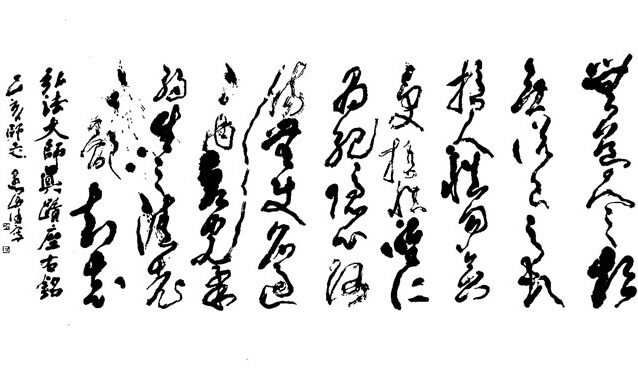
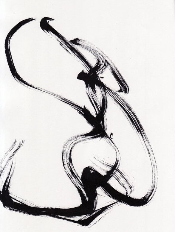
Finally, and on the far right of our handy chart, we have the rare and deadly sōsho. Rare because it is no longer in common use; deadly because it’s harder than heck to actually READ the darn stuff. Tons of strokes are skipped, others combined into one another at angles meant to cover four or more movements with the work of just one. For it to actually work, the artist has to essentially relearn how to write in this new form, replacing the complicated strokes with simpler ones while retaining a standard that allows the recreation of that shape each and every time. Otherwise, it all turns to scribbles.
(Image: syodou.net)
Regarding the appreciation for and practice of sōsho, one expert explained that its very name resembles that of the Japanese word for ‘rough draft’ – it shares the first character. As a result, it is respected as an ancient technique but kept at arm’s length by all but the most hardcore calligraphy artists.
(Image: art.hiden.jp)
Identifying and Appreciating the Art
So now that you have what artists and art critics call ‘visual literacy,’ you should be read to identify the forms and types of calligraphy out there. Coming across a hanging wall scroll, or even a single piece of washi Japanese paper adorned with a Chinese character, you can refer to this article to figure just what to look for in the mass of curves and lines. What style do you like the best?
(Image: hashihime.co.jp)
Still, remember that art is subjective in nature. While ten people might hate that piece you’ve had your eye on, don’t be shy! Japanese calligraphy is, after all, a form of art; and art’s beauty is all in the eye of the beholder!
Author - Jay
In my spare time I enjoy watching baseball, tasting local cuisine, and exploring by road and rail. Having lived in several cities around the world, I have an appreciation for local as well as international histories and cultures. Excited by cultural and social exchange, it is my hope that this blog will help promote an interest in Japanese traditional wares and practises by introducing you to their history and meanings.

About Orientalsouls.com
Learn and Buy Japanese Craftsmanship, Tradition & Culture
OrientalSoul.com is the online shop where you can buy traditional crafts of Japan.
We only sell selected authentic products in which true spirits of Japanese craftsmanship exist.
You may be able to find similar products in other shops for lower prices. However, we sell products based on fair prices that worth labor and value of experienced craftsmen.
In addition, we introduce stories about product history, how a product is made, what makes it different from others, and how the product enriches your life!